5.4. Dispersion (Deviation) of data:
5.4.1
Mean, Median, Mode for grouped data
Sometimes when the scores are large it becomes difficult
to calculate Mean, Median and Modes. When scores are large we use class
intervals to represent data as studied in the 5.1.1. Example
2. When scores are represented in class intervals we follow a slightly
different method for the calculation of Mean, Median and Modes. Let us study
the method using an example.
5.4.1. Example 1:
Assume that the following data about the presence of 110 people from
different age groups in a marriage function is collected.
Working:
|
Class Interval (CI) (Age
groups) |
Frequency (f) |
|
0-10 |
7 |
|
10-20 |
13 |
|
20-30 |
24 |
|
30-40 |
26 |
|
40-50 |
18 |
|
50-60 |
12 |
|
60-70 |
10 |
Note: In the above
distribution, we notice, that in each CI, upper limit of a class interval
appears again as a lower limit in the next class interval (for example 10
appears twice, once in CI: (0-10) and in CI:(10-20)).
Thus the question arises where should the score for upper
limit (10) be included? However, by convention the upper limit is not included
in the corresponding class interval and is included in the next class interval.
(i.e. the score 10 is included in
CI: 10-20 and not in CI: 0-10)
Let us calculate the mean, median and mode for grouped
data.
To recollect, if we had ungrouped scores then
Mean = (![]() )/Number of scores
)/Number of scores
Similarly Median would be in the
interval ‘30-40’ (which has 55th and 56th occurrence of
the score).
Since we do not have individual
scores, it will not be possible for us to arrive at the exact mode and exact
median easily. In such cases we follow a different method:
We use the following notations to arrive at values as
shown below
N = Total number of scores = 110
‘Mid point’(
Or ‘Class mark’)(x) = ![]()
f= frequency
f(x) = f*x
‘Cumulative frequency’ of a class interval is sum of all
the frequencies of all the class intervals up to this class interval.
|
C-I |
Frequency (f) |
Cumulative frequency(cf) |
Mid
Point (x)
of CI |
f(x) =f*x |
|
7 |
7 |
5 |
35 |
|
|
10-20 |
13 |
20=7+13 |
15 |
195 |
|
20-30 |
24 |
44=20+24 |
25 |
600 |
|
30-40 |
26 |
70=44+26 |
35 |
910 |
|
40-50 |
18 |
88=70+18 |
45 |
810 |
|
50-60 |
12 |
100=88+12 |
55 |
660 |
|
60-70 |
10 |
110=100+10 |
65 |
650 |
|
Total |
N=110 |
|
|
|
By definition Mean = ![]() =
= ![]() = 35.09
= 35.09 ![]() 35.1
35.1
Since number of score is 110, Median must be between 55th
and 56th score which is in the class interval ‘30-40’.(because up to
the class interval 20-30 we have 44 (cf) scores and up to the class interval 30-40 we have 70
scores (cf)).
Let
i= size of the class interval =
11(There are 11 scores in each class interval)
L= Lower limit of the class interval which includes the
median score (This CI (’30-40’) is also called Median class interval) = 30 ??
F =Cumulative frequency up to
the median class interval = 44
m = frequency of the median class interval = 26
Then
Median = L+ (![]() )*i
)*i
= 30+ ( )*11 = 30+
![]() *11 = 30+4.65 = 34.65
*11 = 30+4.65 = 34.65
Mode lies in the class interval ‘30-40’ and the formula
for mode is
Mode =
3*median-2mean
= 3*34.65- 2*35.1
= 33.75
5.4.2
Measures of dispersion: Range, Deviations
Let us take the following example of attendance of a class
for 2 different weeks in a month.
First week : 45,44,41,10,40,60 : Mean (average) = 40
Second week: 35,45,40,45,40,35: Mean
(average) = 40
In both the cases, the average attendance is 40. But we
also observe the following:
1. First week has registered a very low attendance of 10
and a high attendance of 60, with maximum deviations (dispersions) from average
where as
2. In the second week, the deviations from average are not
high. In simple terms we can say that attendance is consistent in the second
week.
Thus we conclude that, average may not give a correct
picture.
Therefore we need other measures to arrive at meaningful
conclusions.
We introduce the following concepts:
The difference between two extreme scores of a
distribution is called the ‘Range’
Range = Highest Score- Lowest Score= H-L
Co-efficient of Range = ![]() =
=![]()
We have learnt that, median is a score that divides the
distribution of score in to two equal parts. Similarly we define Quartile as
the distribution of scores in to four equal parts. In such cases the
distribution is divided in to four parts as:
1st Quartile (Q1), 2nd Quartile (Q2),
3rd Quartile (Q3). They are scores at 1/4th, 1/2nd and 3/4th the
distribution of scores.
We note that 2nd Quartile is the Median itself.
Quartile deviation( Semi interquartile-range) is calculated as
QD = (Q3-Q1)/2
5.4.2 Example 1 : Calculate Range, Co-efficient of
Range ,Quartile deviation and Co
–efficient of Quartile deviation for the scores 16,40,23,25,29,24,20,30,32,34,43
Working:
By arranging the scores in ascending order, we get
16,20,23,25,29,30,32,34,40,43.
Note that L= 16, H =43 and N=11
Therefore
Range = H-L = 43-16 = 27
Co-efficient of Range =![]() =
=![]() =0.46
=0.46
Since there are 11elements
-for Q1 the score to be considered is 3rd
(1/4th of 11) score = 23.
-for Q3 the score to be considered is 8th
(3/4th of 11) score = 34
QD = (Q3-Q1)/2
= ![]() = 5.5
= 5.5
Co-efficient of QD = (Q3-Q1)/
(Q3+Q1) = ![]() =
=![]() =0.1
=0.1
For grouped data, we have seen earlier that
If N = Total number of scores,
i = Size of the class interval,
L = Lower limit of the Median class interval,
F = Cumulative frequency (cf) up to the median class interval and
f = frequency of the median class interval
Then
Median = L+ ( )*i = Q2
Similarly for grouped data we calculate
Q1 = L+ ( )*i
)*i
Q3 = L+ ( )*i
)*i
Where
L = Lower limit of the respective Quartile class interval
F = Cumulative frequency (cf) up to the respective Quartile class interval
f = frequency of the respective Quartile class interval
5.4.2 Example 2: Calculate Range, Co-efficient of
Range, Quartile deviation and Co –efficient of Quartile deviation for the
grouped data of 100 scores
|
CI |
f |
|
4-8 |
6 |
|
9-13 |
10 |
|
14-18 |
18 |
|
19-23 |
20 |
|
24-28 |
15 |
|
29-33 |
15 |
|
34-38 |
9 |
|
39-43 |
7 |
Working:
Here we have N = 100, i = 5 and
let us calculate cumulative frequency as follows:
|
CI |
f |
cf |
|
4-8 |
6 |
6 |
|
9-13 |
10 |
16 |
|
14-18 |
18 |
34 |
|
19-23 |
20 |
54 |
|
24-28 |
15 |
69 |
|
29-33 |
15 |
84 |
|
34-38 |
9 |
93 |
|
39-43 |
7 |
100 |
For Q1 we need to find 25th (1/4th
of 100) element which lies in the class interval ’14-18’
L= 13.5, F=16, f= 18
Q1 = L+ () * i
= 14 +![]() *5 = 14 + 2.5 = 16.5
*5 = 14 + 2.5 = 16.5
For Q3 we need to find 75th (3/4th
of 100) element which lies in the class interval ’29-33’
L = 29, F = 69, f = 15
Q3 = L+ ()*i
=29+![]() *5 = 29+2 =31
*5 = 29+2 =31
QD = (Q3-Q1)/2
= ![]() =7.25
=7.25
Co-efficient of QD = (Q3-Q1)/
(Q3+Q1) = ![]() =
=![]() =0.31
=0.31
5.4. 3 Mean Deviation for Ungrouped
data:
As the name suggests, here we calculate the average
deviation from the mean.
Note: Mean Deviation can be found in two ways -
using Median method or using Mean method.
5.4.3
Example 1. Calculate the mean deviation for the scores
given below, by BOTH methods.
90,125,115,100,110.
Working:
By rearranging the scores in increasing order we get
90,100,110,115,125
Here we have N= 5, ![]() = 90+100+110+115+125=540
= 90+100+110+115+125=540
![]() The median (M) = 110
(3rd term)
The median (M) = 110
(3rd term)
The mean (![]() ) of scores
) of scores
is = ![]() =
= ![]() =108
=108
|
Scores(X) |
I Method Deviation from Median D=
X-M |
II Method Deviation from Mean |
|
90 |
-20(90-110) |
-18(90-108) |
|
100 |
-10(100-110) |
-8(100-108) |
|
110 |
0(110-110) |
2(110-108) |
|
115 |
5(115-110) |
7(115-108) |
|
125 |
15(125-110) |
17(125-108) |
|
|
|
|
In the above calculation |D| is the absolute value of D
(we consider value of D as always positive).
By Median method, Mean deviation = ![]() =
= ![]() =10
=10
By Mean method, Mean deviation = ![]() =
= ![]() =10.4
=10.4
5.4.4 Mean Deviation for Grouped
data:
Note: As in the case of ungrouped data, Mean
Deviation can be found in two ways (Using Median method and Mean method)
5.4.4
Example 1.
Compute Mean Deviation of
|
C.I |
f |
|
0-20 |
8 |
|
20-40 |
10 |
|
40-60 |
19 |
|
60-80 |
14 |
|
80-100 |
9 |
Workings:
Here we have N = 60 and i= 21
Median (M) = L+ (![]() )*i
)*i
= 40 +![]() *21 = 40+13.3 = 53.3 (Use the values from the table arrived
below)
*21 = 40+13.3 = 53.3 (Use the values from the table arrived
below)
Mean (![]() ) =
) = ![]() =
=![]() = 52 (Use the values from the table arrived below)
= 52 (Use the values from the table arrived below)
|
C.I |
Mid Point (x) |
f |
I Method Deviation from Median |
II Method Deviation from Mean |
||||
|
cf |
D = x-M |
f*|D| |
fx |
D = x- |
f*|D| |
|||
|
0-20 |
10 |
8 |
8 |
-43.3 |
346.4 |
80 |
-42 |
336 |
|
20-40 |
30 |
10 |
18 |
-23.3 |
233 |
300 |
-22 |
220 |
|
40-60 |
50 |
19 |
37 |
-3.3 |
62.7 |
950 |
-2 |
38 |
|
60-80 |
70 |
14 |
51 |
16.7 |
233.8 |
980 |
18 |
252 |
|
80-100 |
90 |
9 |
60 |
36.7 |
330.3 |
810 |
38 |
342 |
|
|
|
N=60 |
|
|
|
|
|
|
By Median method, Mean Deviation = ![]() =
=![]() = 20.10
= 20.10
By Mean method, Mean Deviation = ![]() =
=![]() = 19.8
= 19.8
5.4.5. Graphical representation of
frequency distribution
In earlier sessions we have seen that, graphical
representation of data is always easy to understand and interpret. Two
important types of representations are histogram and frequency polygon.
Histogram: Here we represent the distribution in vertical
rectangles. The rectangles are drawn side by side. The vertical height is
proportional to the frequency and is represented on y axis. The class intervals
are represented on x-axis .
We need a graph sheet for this type of representation.
Class intervals (CI) are marked as the base of rectangle on x axis. Frequencies
are marked as the height of rectangle on y axis.
5.4.5
Example 1. Draw
histogram and frequency polygon for
|
C.I |
f |
|
0-20 |
8 |
|
20-40 |
10 |
|
40-60 |
19 |
|
60-80 |
14 |
|
80-100 |
9 |
Working:
Use a suitable scale for representing Class interval and
frequency
(In this case let 1C.I = 1cm and 2f=1cm)
Histogram:
|
Step 1:
Take a graph sheet. Mark 0 and draw x –axis and y-axis. Step 2:
On the x-axis mark the class intervals adjacent to each other from 0. Use 1cm
as the width of each class interval. (Thus the scale for C.I. is 1C.I. = 1cm) Step 3:
Convert frequency to a suitable unit so that the graph fits into one page
easily. In this
example use the scale 1cm = 2f. Therefore we have: 8f =4cm, 10f =5cm, 19f = 9.5cm, 14f
= 7cm and 9f =4.5cm. (Thus
the scale for frequency is 2f = 1cm)
Step 4:
Draw a rectangle of height 4cm representing the first CI (0-20) Step
5: Draw a rectangle of height 5cm
representing the next CI 20-40, next to the previous one, so that these two vertical bars
have a common side. Draw
the remaining rectangles for other class intervals. |
|
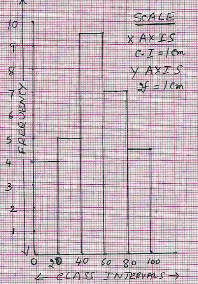
Observations:
1.Class intervals are represented on x
axis and frequency on y axis
2.The scales chosen for both the axes
need not be same.
3. Since the sizes of class intervals are same, width of
the rectangles are also same.
4. Since there are no gaps in the class intervals the rectangles
are contiguous (No space in between them).
5. Height of the rectangle is proportional to the
respective frequencies of the C.I.
Note : If there are breaks in the class intervals(usually in the
beginning) a zig-zag
curve (is drawn between the class
intervals).
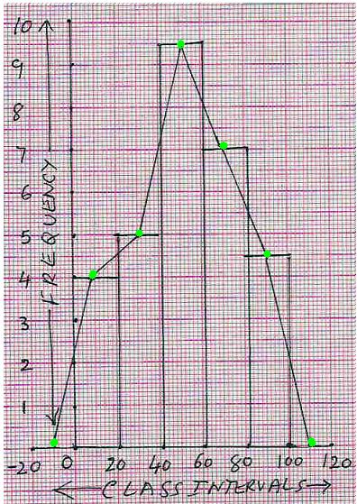
Frequency Polygon
(Method I):
When the mid points of the adjacent tops of the rectangles
are joined by straight lines, the figure so
obtained is called ‘frequency polygon’
|
Step
1: Draw the histogram as above. Step 2:
Mark non existing class interval (since f = 0,
height = 0cm) one each at two extreme ends (i.e. (-20) - 0 on the left side and 100 -120 on the
right side). Step
3: Identify middle point for each of
the class interval bars (at -0.5, 0.5, 1.5, 2.5, 3.5, 4.5 and 5.5cms on x-axis and
y being (0, 4, 5, 9.5, 7,4.5 and 0 ) respectively).
Step 4: Join two consecutive mid points of bars by
a straight line to get the required polygon |
|
Frequency Polygon
(Method II):
|
Step 1:
Mark non existing class intervals one each at two extreme ends (i.e. (-20) - 0 on the left side and 100 - 120 on the right side).
Step
2: Identify middle point for each of
the class intervals as per the scale used (in this example 1C.I. = 1cm). These points are
-0.5, 0.5, 1.5, 2.5, 3.5, 4.5 and 5.5 on the x-axis. Step
3: Identify the height of frequency for
each class interval as per the scale used (2f=1cm). These points are 0, 4, 5, 9.5, 7,4.5 and 0 on the
y-axis. Step 4:
Plot and join these points. |
|
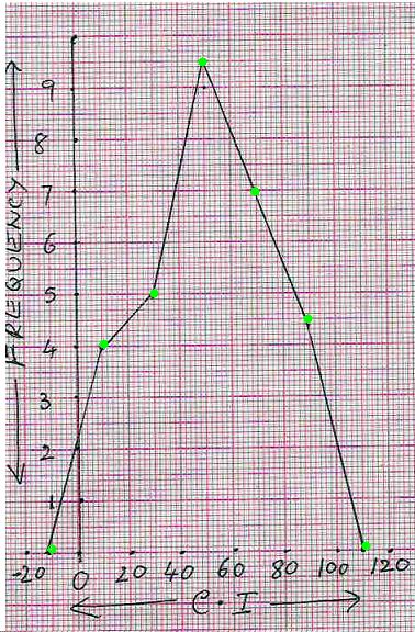
Note : If the
mid points of class intervals are very close, then we get a frequency
curve by joining these points by a smooth curve rather than joining by straight lines.
5.4 Summary of learning
|
No |
Points to remember |
|
1 |
Mean = |
|
2 |
Median = L+ ( |
|
3 |
Mode = 3*median-2mean(For
grouped data) |
|
4 |
Co-efficient of Range = |
|
5 |
Mean deviation = |
|
6 |
Mean Deviation = |
Additional Points:
5.4.1 Assumed mean method for calculation of mean for grouped data
This method is very useful when class
intervals and their frequencies are very large. In this method we assume one of
the mid-points to be the mean and find the deviation from that mid-point and
hence this method is called ‘assumed mean method’.
Let us take the example solved
earlier (5.4.1 Example 1) to illustrate this method.
Let 25 be the assumed mean (any score can be assumed
to be the mean but we normally take the score which
is in the middle part of the distribution as assumed mean)
The Deviation D (D = Score-
Assumed mean) is calculated for each of the score.
Then Average (mean) = A + (![]() )/Number of scores
)/Number of scores
|
C-I |
Frequency (f) |
Mid
Point (x)
of CI |
Deviation D= A-M |
fD= f*D |
|
0-10 |
7 |
5 |
-20(=5-25) |
-140 |
|
10-20 |
13 |
15 |
-10(=15-25) |
-130 |
|
20-30 |
24 |
25= A |
0 |
0 |
|
30-40 |
26 |
35 |
10(=35-25) |
260 |
|
40-50 |
18 |
45 |
20(=45-25) |
360 |
|
50-60 |
12 |
55 |
30(=55-25) |
360 |
|
60-70 |
10 |
65 |
40(=65-25) |
400 |
|
Total |
N=110 |
|
|
|
Average (mean) = A + (![]() )/Number
of scores = 25+1110/110 = 25+10 = 35
)/Number
of scores = 25+1110/110 = 25+10 = 35
This is the same value(approximate)
which we got earlier.
5.4.5 Cumulative Frequency Curve (Ogive):
In this type of graph we plot the points corresponding to
cumulative frequency for the given data (Ungrouped or grouped) and join the
points by a smooth curve.
The given data (actual score or Upper class limit in case
of grouped data) is marked along the x-axis. Cumulative frequency is marked
along the y-axis.
Let us again consider the same example we have taken in 5.4.5
Example 1.
5.4.5
Example 2. Draw Ogive
for
|
C.I |
f |
|
0-20 |
8 |
|
20-40 |
10 |
|
40-60 |
19 |
|
60-80 |
14 |
|
80-100 |
9 |
Working:
|
1. First
arrive at an ‘imaginary’ class interval
with 0 frequency (In this case -20 to 0). 2.
Prepare the cumulative frequency table as shown below starting with the imaginary class interval (-20 to 0).
3. Use
a suitable scale for x-axis for representing the upper Class limit (In
this case let 1cm=10 upper class limit). 4. Use
a suitable scale for y-axis for representing the cumulative frequency (In
this case let 1cm =10cf) 5. Plot
the points corresponding to each upper class limit as shown in the adjacent graph. 6. Join
these points by a smooth curve (This curve is Ogive). |
|
From the cumulative frequency curve it will be
easy to arrive at frequencies for different class intervals.
(For example: From the above graph we can conclude that
the cumulative frequency for scores up to 30 is 13. This point is circled red in the graph).