5.1.
Introduction to Statistics:
Introduction:
1. What will be the population of
2. What is the literacy rate of
3. What is the % of kids not attending to school. What will be status in next 10/15 years?
4. What is the deviation in salary among people working
in an organization?
Statistics a branch of Mathematics helps to find answers to these types
of questions.
In our
daily life we come across news about average rainfall in a place, Minimum and
maximum temperatures in a place, average runs scored by a cricketer, average
attendance and similar terms. They are all calculated based on data. They are
useful for planning by agencies such as Government, for comparing performance
of people and for other purposes.
You
must have heard people saying that a month of current year has been very
hot. This observation is normally based on
their feeling. However this feeling can be checked by correct data. The
Metrological department has many recording stations where they measure the
minimum and maximum temperatures daily.
Let us
tabulate the maximum and minimum temperatures of a city in north
|
Month |
January |
February |
March |
April |
May |
June |
July |
August |
September |
October |
November |
December |
|
Maximum (Mid Day) |
15
|
14 |
20 |
18 |
35 |
36 |
40 |
41 |
35 |
30 |
25 |
22 |
|
Minimum (Early Morning) |
6 |
7 |
10 |
10 |
20 |
22 |
24 |
25 |
22 |
20 |
15 |
-5 |
From the above data it is
difficult to guess the temperature in the middle of any month in a year. Let us
see what if we represent the above data in a graph:
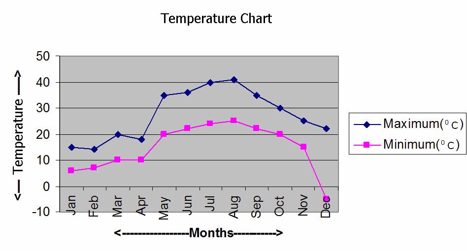
Graphs
The above pictorial
representation is recording of Maximum and minimum temperatures of a place for
the Months of January to December (lowest and highest among any days in those
months) of a year. Blue color line represents the Maximum temperature and pink
color line represents the minimum temperature. This plotting has been done
based on the following data:
Table:
|
Jan |
Feb |
Mar |
Apr |
May |
Jun |
Jul |
Aug |
Sep |
Oct |
Nov |
Dec |
|
|
Maximum(0C) |
15 |
14 |
20 |
18 |
35 |
36 |
40 |
41 |
35 |
30 |
25 |
22 |
|
Minimum(0C) |
6 |
7 |
10 |
10 |
20 |
22 |
24 |
25 |
22 |
20 |
15 |
-5 |
Looking at the data in the
above table, isn’t it difficult to estimate the temperature in the middle of
any month?
Don’t you agree that
pictorial representation (called Graph) is much easier to understand compared
to the data given in the above table?
Isn’t there a saying that a
picture represents more than what thousand words say?
Let us understand how this
graph has been plotted.
On the horizontal line we
see names of months. Each month is separated by a gap of around 1cm in length
and we say that the horizontal scale is 1cm = 1month. On the vertical line we
see markings in steps of 10 starting with -10 ( i.e.-10,0,10,20,30,40,50). We
notice that the distance between two markings on vertical line is approximately
1cm and we say that the vertical scale is 1cm = 100C. Since we do
not have temperatures recorded in excess of 500C, the markings have
been stopped at 500C. Since we do not have minimum temperatures
recorded below -100C, the markings haven’t been provided for -200C
and below that. Though in this example the scale for horizontal and vertical
lines is same, they need not be same always. Here we used the scale of 1cm.
Scale is determined in such a way that all data can be marked on the sheet.
Note that from the graph it
is possible to estimate easily the minimum and maximum temperature during
middle of any month which is not possible to arrive at easily by looking at
data in the table.
In case of geographical
map, you must have observed that the scale used for distance as 1cm =1000Km.
By convention we call the
horizontal line as x axis and vertical line as y axis. Any point in a plane(surface) is represented by coordinates(x, y).
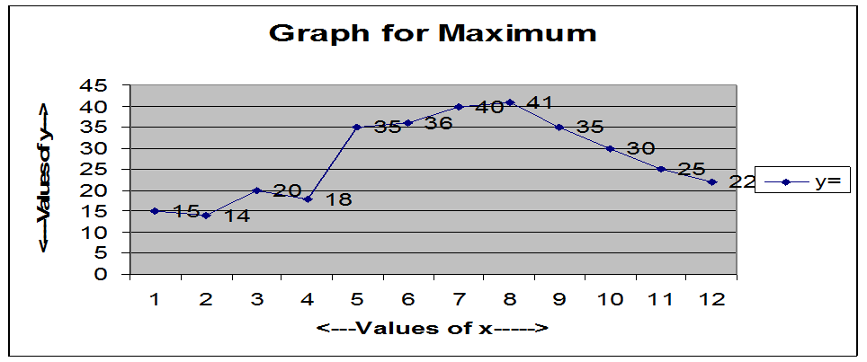
5.1.1 Example 1: Draw
a graph for maximum temperatures based on the above table. Horizontal line(x
axis) will represent months and vertical line(y axis) will represent maximum
temperatures. The months are represented from 1 to 12 for January to December.
Then the coordinates are:
|
x à |
1 |
2 |
3 |
4 |
5 |
6 |
7 |
8 |
9 |
10 |
11 |
12 |
|
y à |
15
|
14 |
20 |
18 |
35 |
36 |
40 |
41 |
35 |
30 |
25 |
22 |
|
(x, y)à |
(1,15) |
(2,14) |
(3,20) |
(4,18) |
(5,35) |
(6,36) |
(7,40) |
(8,41) |
(9,35) |
(10,30) |
(11,25) |
(12,22) |
For marking temperatures we
can use the scale 1cm = 50C and start marking from 00C,
in multiples of 5(0,5,10,15..). After marking the
points (x,y) and joining
them, we get a graph as shown below.
5.1.1 Example 2: Assume
that you have collected the following data of time taken to run 100 Meters race
in your school games for the years 2000,2001,2002,2003 and 2004 (First 3 places
only).
|
No |
Name |
Class |
Year |
Time taken to run
100Meters race |
|
1 |
Ram |
8 |
2000 |
15sec |
|
2 |
John |
9 |
2000 |
16sec |
|
3 |
Krish |
10 |
2000 |
17sec |
|
4 |
Luis |
9 |
2001 |
12sec |
|
5 |
Sham |
8 |
2001 |
17sec |
|
6 |
Gopal |
9 |
2001 |
19sec |
|
7 |
Ahmed M |
9 |
2002 |
13sec |
|
8 |
Khan A K |
8 |
2002 |
16sec |
|
9 |
Arun |
10 |
2002 |
17sec |
|
10 |
Mohan |
10 |
2003 |
16sec |
|
11 |
Philips |
8 |
2003 |
17sec |
|
12 |
Ajay |
9 |
2003 |
18sec |
|
13 |
Pramod |
9 |
2004 |
14sec |
|
14 |
Raymond A |
8 |
2004 |
15sec |
|
15 |
Gopi |
9 |
2004 |
15sec |
Let us
consider only those data corresponding to the time taken by students for
running the race. We have 15,16,17,12,17,19,13,16,17,16,17,18,14,15,15 secs.
Since the
above data is not in any particular order, let us arrange them in ascending
order. We get
12, 13,
14, 15, 15, 15, 16, 16,
16, 17, 17, 17, 17, 18, 19..
|
No |
Time (sec) |
Occurrence(Frequency) |
|
1 |
12 |
1 |
|
2 |
13 |
1 |
|
3 |
14 |
1 |
|
4 |
15 |
3 |
|
5 |
16 |
3 |
|
6 |
17 |
4 |
|
7 |
18 |
1 |
|
8 |
19 |
1 |
|
Total |
=15(Total No of
Scores) |
|
The
above representation of data called ungrouped frequency distribution table.
From the
above tabulation we observe the following:
1. Lowest
time taken is 12 Seconds which happened in the year 2001.
2. Highest
time taken is 19 Seconds (among first 3 winners) which happened in the year
2001.
3. The
number 17 has highest occurrence of 4, indicating that most of the prize
winners took 17
Seconds to run the distance.
Let
us regroup the data as follows:
|
No |
Grouping (Class-Interval) |
Occurrence(Frequency) |
|
1 |
12sec -14sec |
3 |
|
2 |
15sec-17sec |
10 |
|
3 |
18sec -20sec |
2 |
|
Total |
=15(Total No of Scores) |
|
The
above representation of data is called grouped frequency distribution table.
When scores (data) are
large in number, grouped frequency distribution tables are very easy for
analysis.
If we
group students into 3-Second time intervals {i.e. (12-14),(15-17),(18-20)} we find the interval of (15sec-17sec) has the highest occurrence of 10, indicating that most of the
prize winners took between 15 to 17
seconds to run the distance. We also notice that if we group results in
different time intervals the conclusion will be different.
5.1.2
Statistical terms
The
numbers we have collected are called ‘Scores
(observations)’. The number of
times a particular score occurs is called ‘Frequency’. Some times we group the scores in ranges
(intervals) for meaningful analysis and such sub groups are called ‘Class-intervals’. This
class interval is never fixed and can vary. Based on the class interval chosen,
the conclusion could change. (In the above example we can choose class intervals of 4
-Seconds(ex 12sec-15sec,16sec-19sec).Once a class interval is chosen all data
has to be grouped as per this grouping (i.e. in the above example we can not
have 2-second intervals and 3-second intervals at the same time).The difference
between the highest and the lowest values of the scores(data) is called ‘range of data’. The difference between lower and upper limits of two consecutive classes
is called ‘size
of the class’
Thus ‘Statistics’ could be defined as science of
collection, classification, analysis and interpretation of basic numerical
data. It finds applications in prediction of economic growth of a country,
weather pattern of a region, etc. These
scientific predications help Government and Agencies to plan for future.
Statistics is used in
Genetics, Biological sciences, Education, Medicine, Economics.
5.1
Summary of learning
|
No |
Points to remember |
|
1 |
The
numerical figures collected for analysis are called scores |
|
2 |
The
number of times a score repeats itself is called frequency |
|
3 |
The data
arranged in the format of a table containing the score and its frequency is
called frequency distribution table. |
|
4 |
Grouping
of scores in to smaller groups is called class interval. |