5.2 Graphical Representation of
Data:
Bar Chart
5.2 Example 1:
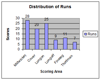
You or your friend as a cricketer must be scoring runs in your school matches.
In one of such match assume you/your friend had scored a century by scoring
runs all around the wicket. The scoring must have been across 6 major areas
(Midwicket, Cover, Longon, Longoff,
Fineleg & Thirdman)
of the wicket. The scoring pattern for 100 runs is given in the table given
below:
Workings: Let us draw a table with scoring area and runs scored as shown below:
|
|
This
data can be pictorially represented as shown in the adjoining figure (Bar
chart). The
vertical line has markings in steps of 5 runs (from 0 to 30). The
names of the area are marked on the horizontal line and each area is represented
by a bar. The height(length) of the bar is proportional to runs scored. Width
of the bars is same. The
space between bars is same |
|
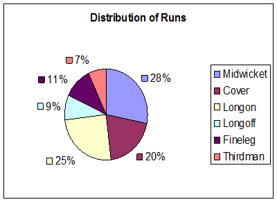
Pie Chart
|
Let us
represent the above data in a different format as shown in the adjoining figure
called Pie Chart. Here
the areas are represented by different colors, starting with Midwicket area,
the area in which highest runs were scored (28%). In this
type of chart, runs are represented by the size of the sector converted to
percentage. Higher
the percentage, larger will be the size of the sector (converted to
percentages). If you
compare the above two types of pictorial representations for the same data
(Bar chart and Pie chart), don’t you think that Pie Chart is more appropriate
as compared to Bar chart in this example. Why? |
|
|
The reason is Pie
chart gives us a complete picture of scoring pattern and sum of percentages
of all sectors = 100%. Bar chart is suitable
when the data values expressed as %, do not add up to 100% (like in the case
of data for several time periods, countries etc) |
|
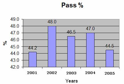
5.2 Example 2: Let us consider the following
example of results of a Board examination given in pass percentage for few
years as given below:
|
|
In the
adjoining figure, we have marked pass % from 42 and not from 0. (If done
from 0, the graph would have become too big) |
|
Construction of Bar and Pie charts
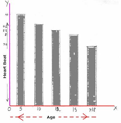
5.2. Example 3:
Draw a suitable chart to represent the following data about heartbeat of
a human being.
|
Age in
years à |
5 |
10 |
12 |
15 |
Above
18 |
|
Heart
beats/ Minute à |
100 |
90 |
85 |
80 |
72 |
Solution:
|
We
notice that heartbeats can not be expressed as % and hence Pie chart can not
be drawn for this set of data. We have to represent this data as Bar chart. Step1. On
a sheet of paper or graph sheet, draw a horizontal line OX, Step2. Draw a vertical line OY perpendicular to OX
at O OX will
be the line which will represent Ages and OY will be the line which will
represent heartbeats. Step 3.
Since heartbeats are between72 and 100, we use the scale 1cm = 10 heartbeats.
So we
have 100 hearbeats =
100*1cm/10 = 10cm 92 heartbeats = 92*1cm/10 = 9.2cm 85 heartbeats = 85*1cm/10 = 8.5cm 80 heartbeats = 80*1cm/10 =
8cm 72 heartbeats = 72*1cm/10 = 7.2cm These
will be the heights of bars. Step 4.
On line OX, mark ‘5’ at approximately 1.5cm away from O (this will represent the
age group 5). Step 5.
Construct a bar of height 10cm (=100 heartbeats) and width of 1cm above ‘5’.
This bar will represent the age group 5. Step 6.
Mark ‘10’ at approximately 1.5cm away from the above bar (this will represent
the age group 10). Step 7.
Construct a bar of height 9cm(=90 heartbeats) and
width of 1cm above ‘10’. This bar will represent the age group 10. Step 8.
Repeat steps 6 and 7 for the remaining age groups of 12, 15 and ‘>18’ with
heights of bar equal to 8.5cm, 8cm and 7.2cm respectively. Width of the bar
will be same(1cm) |
|
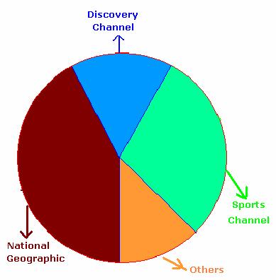
5.2 Example 4:
Draw a chart for viewer ship (viewing pattern) of different channels, among 250
students, which is given below.
|
No |
Channel |
Students |
|
1 |
National Geographic |
100 |
|
2 |
Discovery Channel |
50 |
|
3 |
Sports Channel |
75 |
|
4 |
Others |
25 |
Solution:
|
Since
students belonging to each category can be expressed as % of the total (250), we
need to draw a Pie Chart. Step 1 : Calculate the size of sector proportionate to the
number of students for each of the above 4 categories. Note : Angle at center of circle is 3600.
We
multiplied each of the student count by 360 and divided them by total number
of students (250) to get the proportionate size of the sector. Step2. Draw
a circle of suitable radius Step3.
Mark the above angles at the center of the circle and draw sectors
correspondingly. Step4.
Shade them suitably so as to distinguish each of the sectors and write names
of the channel in the appropriate sector. |
|
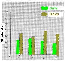
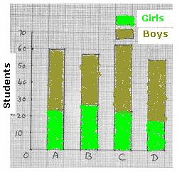
5.2 Example 5:
The four sections in 10th standard of a school have below mentioned
class strength
|
Section |
Girls |
Boys |
Total |
|
A |
24 |
36 |
60 |
|
B |
27 |
30 |
57 |
|
C |
23 |
40 |
63 |
|
D |
19 |
35 |
54 |
Represent the above data in
a suitable format.
|
|
We
could draw two bar charts for the above data (One
for boys, one for girls separately) In such
a case since charts are different, it would not be possible to read and compare
data easily. If we
represent data for girls and boys side by side as in figure on the left hand
side it becomes easy for analysis. Such a
bar chart is called ‘Joint Bar Diagram (chart)’ As an
alternative, what if we represent data in the same bar one above the other,
like in the figure on the right hand side? Such a
bar chart is called ‘Sub-divided bar chart’ |
|
5.2
Summary of learning
|
No |
Points to remember |
|
1 |
Bar chart
is a method of representation of data in bars of equal width. However length
of the bar is proportional to its figure (number). |
|
2 |
Pie
chart is a method of representation of data in terms of sectors of a circle.
The size of sector is proportional to its figure (number). |